

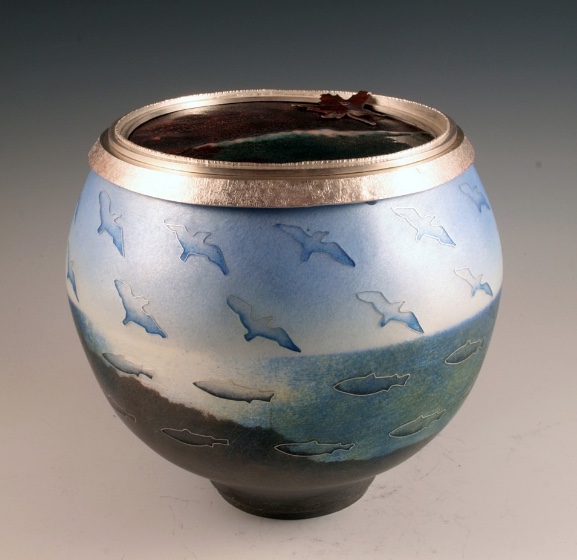
If you saw our recent exhibit Place as Landscape/Place as Concept: Contemporary Enameling in the U.S., mounted in conjunction with the Richmond Art Center, you will already be familiar with the enamel art of René Roberts. Three works from Roberts’ “Salt Point” series, otherworldly interpretations of the coastal geography near her home, were featured in that show. Here, she shares with us some of the technical and creative challenges of creating this series–and her beautiful solutions.
Salt Point Tafoni #7, from the exhibit Place as Landscape / Place as Concept, 2019 with the Center for Enamel Art and Richmond Art Center
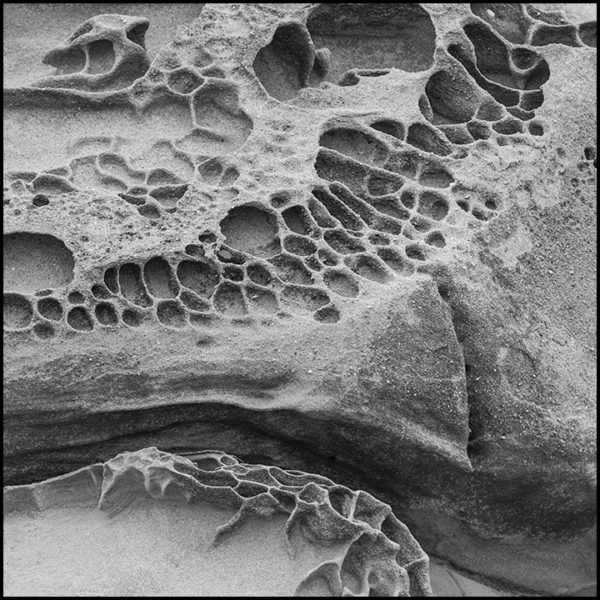
The champlevé enamels from my “Salt Point” series represent a type of sandstone formation called tafoni, found at Salt Point State Park in Northern California.
I’ve been photographing this strange sculptural landscape for many years. Photography is the way I study and get to know each rock, and my photos of this location number in the thousands. When I hike this stretch of coastal headlands, I feel like I’m entirely transported to another world.
I began etching Salt Point images in 1995, and enameling them in 2003. I came to the enamel medium from glass, which I had been working with since 1978. I’d also done a lot of work with experimental copper patinas, so my original intent was to marry these media and see realistic glass enameled images completely embedded in dark colored metal, like quartz might be embedded in stone. I was also intrigued by the three-dimensionality that etched and colored images appeared to have when viewed from a distance. This 3-D effect imparts a quality of “there and not there” that, for me, captures the mystery of the Salt Point landscape.
My goal of achieving photo-realistic champlevé took several years to achieve, and posed many technical challenges. These notes aren’t intended to be a technical tutorial or “how-to,” but rather to give a broad overview of how my pieces are created, some of the technical issues involved, and my approach to solving some of the problems. For those who are interested in knowing more, I’ve provided a few resources.
There are three major technical hurdles: creating a realistic etchable image from a grayscale photograph, using an etching resist that will hold up long enough in the etchant for the depth I require, and finding enamel(s) that will stay white-ish in tiny areas over several firings.
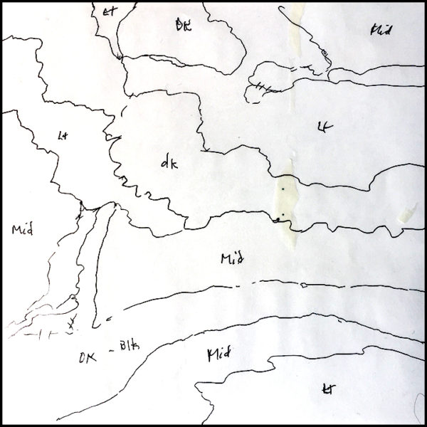
1. My first hurdle is to etch a photo that originally has just a lot of textural grays. Etching is an “on or off” process that requires an image that is only black and white, without any grays. Strong graphics etch the best, so subtle rocks present a particular challenge because they are mostly a uniform value.
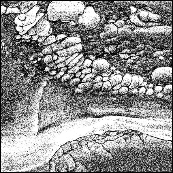
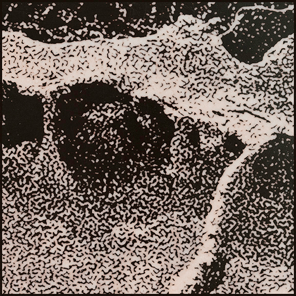
Original grayscale image for “Salt Point Tafoni #5”. I selectively heighten the contrast and work on the gray areas to make sure the halftone negative can actually be etched.
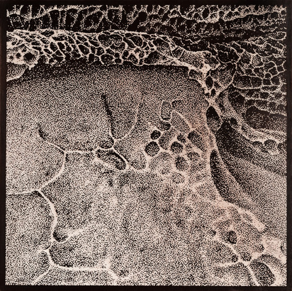
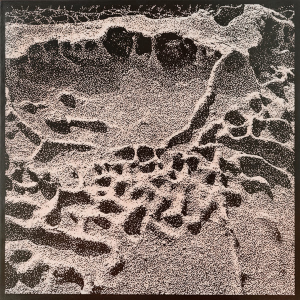
First I adjust the contrast of the image in Photoshop. Because the image needs to be only blacks and whites, I apply a halftone screen that breaks the gray image into dots. I now have a white background with tiny black dots, and the realistic image is still intact.
Image choice requires a lot of cropping, testing, and contrast adjustments to make something work for etching and enameling. This is where I spend lot of my “art time”. Each image can often take days to fine tune. Sometimes trial etching runs are required. I don’t want to waste expensive enamel on something that should have been fixed in the computer!
My process requires exposing a negative of the image onto the copper, so next I use Photoshop to reverse the blacks and whites of the halftone image. Then I print the negative onto clear acetate film that’s made for photographic negatives. I use Pictorico, but others are available.
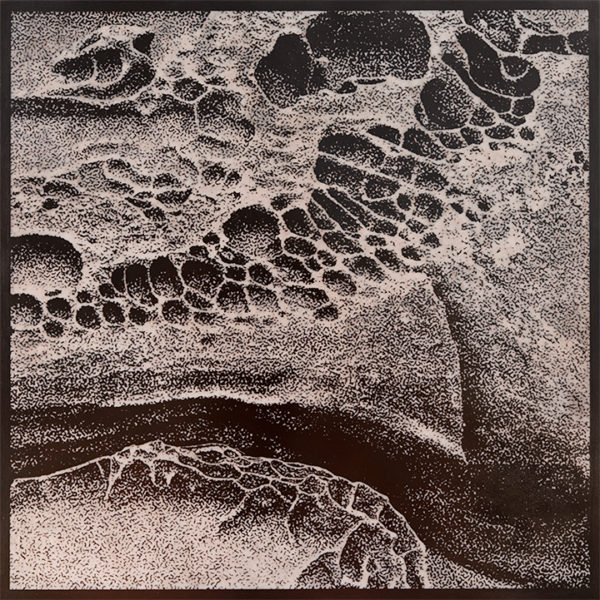
Halftone negative; black and white have been reversed in Photoshop and printed on acetate film.
2. The champlevé process requires filling deeply etched areas with enamel. The next challenge is to create a resist with tiny dots, some as small as .5mm, that will hold up in ferric chloride for the several hours needed for this deep etch.
To accomplish this, I use a photopolymer film that hardens with UV light, with a non-toxic technique developed by printmakers. The brand of film I use is ImagOn, but there are others available. I’ve found that this film holds up for a very long time, much better than PnP Blue, and even the tiniest dots stay put.
Working in a darkroom, I coat a sheet of copper with the photopolymer and expose it to UV light using the computer negative I created earlier. UV light will harden this film so it becomes a tough coating that is an etching resist. Clear areas of my negative will harden the ImagOn with light, becoming the solid copper blacks of the image. Black areas of the negative will block the light and will wash away during development, becoming the etched and enameled whites.
After exposure, I “develop” the copper plate in sodium carbonate, which is washing soda available at the grocery store. Unexposed areas (the blacks on the film) are dissolved, and will etch. The clear areas on the film have allowed the ImagOn to harden with light, and those won’t dissolve upon developing. Those areas will resist etching.
More technical information on how to use ImageOn film can be found in a very good book by Keith Howard, called The Contemporary Printmaker. Other good how-to’s for another resist called Puretch exist on YouTube. The films can be purchased from companies selling printmaking supplies, such as Takach Press and Cape Fear Press, and they generally come with instructions for exposure and development.
3. Next I etch the copper panel in ferric chloride for about four hours. Every place that has ImagOn film still on it will resist the acid; all the bare areas will be etched to a depth of about .5mm to 1mm.
Many metalsmiths are now using galvanic etching instead of ferric chloride, and there are many advantages to etching this way. However, my halftone dots are so tiny that with the galvanic process they are often destroyed before my etch gets to my required depth. I am still experimenting to make this process work for me.
4. Now comes the tricky part. Deeply etched areas will receive very finely ground white enamel, which I apply wet over the entire piece like a thin mud. It requires about three applications of enamel to completely fill the etched areas, with a firing and stoning with an alundum stone between each application.
“Salt Point Tafoni #5” after first firing and before stoning, with texture still very visible. Two more applications and firings of enamel will be required to fill the texture.
The copper oxide will always color the white enamel, imparting a pink or greenish cast to it. The most challenging part of doing these pieces is controlling this discoloration in the tiny areas. All of my tiny areas can turn green or black if I’m not careful!
First I do sample tests of many white enamels, to see how each one discolors in the tiniest halftone areas. Then I mix a number of different white enamels together, depending on the colors each one wants to shift, to control this discoloration. Every image receives a slightly different color formula, depending on the end result that I want. I use both leaded and unleaded enamels, often mixing them together.
I also control firing time and temperature very carefully because the dots of enamel are so easily colored by copper oxide.
Some of the other steps are more mechanical, but the enamel testing and application takes up much of my time.
5. The copper warps differently in black or dark gray areas than it does in light areas. This can pose a significant issue with mounting the piece in a professional way. With each enamel coat, I selectively build up counter enamel on the back to control warpage, according to the black and white areas of the image. I create a stencil design that I cut into shapes, so I can counter-enamel selected areas with each firing.
“Salt Point Tafoni #5” counter-enamel plan showing rough areas of lights and darks. The shapes will be cut apart and used as stencils for selective thicknesses of counter-enamel.
“Salt Point Tafoni #5”, with first application of counter-enamel. Counter-enamel is adjusted with each firing, as the front side fills up and the piece begins to warp.
6. After the last enamel application, firing and stoning, I polish the bare copper and enamel to a smooth matte finish with a series of diamond pads, ranging from 80 to 400 mesh.
I then fire the piece one last time to fire polish the enamel, and finally the copper is pickled in acid to clean off all the fire scale. I’m careful to control the time the piece is left in the pickle, so as to not allow the acid to etch the enamel.
7. Lastly I immerse the piece in a patina solution that blackens the copper. This step allows the lights and darks of the landscape to be revealed.
Then I wax the entire piece to prevent the dark copper from being discolored with finger oils.
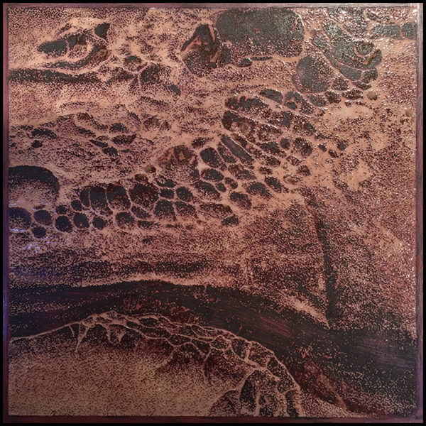
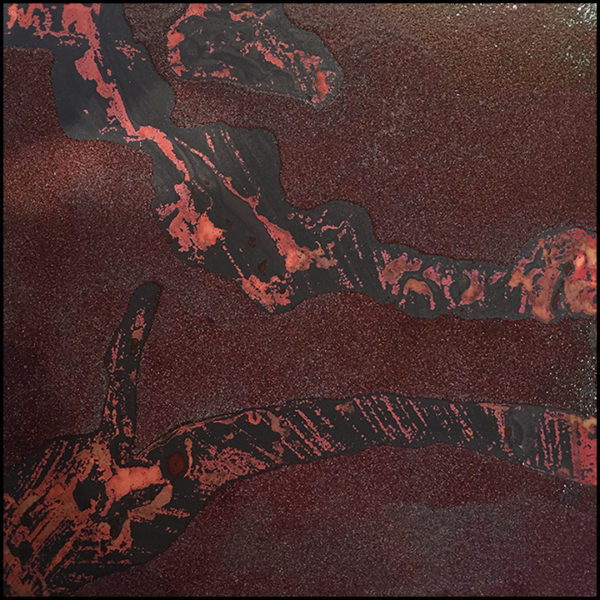
“Salt Point Tafoni #5”, the finished piece. Warm and cool color variations happen as the copper oxides color the glass. Different enamels impart different oxide colors, ranging from pink, blue, or green.
“Salt Point Tafoni #4”
Detail, “Salt Point Tafoni #4.” The smallest dots are less than .5mm across, and will rapidly discolor with firing. This can be controlled with various enamel formulas and very careful firing times. Sometimes shadows will take on a different color cast than highlights, and this can enhance the 3D effect of the piece.
How long does this all take? Including the computer work, an 8”x8” piece takes about two weeks, start to finish. (Tromping around the landscape and mounting the finished pieces takes longer.) I often work on 3 or 4 pieces together to expedite the whole process.
 René Roberts cut her first piece of glass in 1978 while working as a criminal trial lawyer. With a passion for experimentation, a background in chemistry, and a high tolerance for methodical, time-consuming processes, she soon embarked on what would become a 40-year exploration of glass, metal and fire. She became obsessed with fusing and casting glass in a kiln, and later, with torch-firing copper and silver to create an ethereal color palette. In 2002, she began using the enamel process of champlevé, incorporating imagery from her own photographs into her work. Over the years, she has reinvented her materials in several media to create visual hybrids that explore the enigmatic landscape she calls home. Her work has appeared in several books, including Formed of Fire, Masters: Glass Beads, and 500 Enameled Objects. To see more of her work, visit www.reneroberts.com.


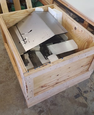 The more sculpture I make, the more I realize one of the biggest hurdles is shipping. It is not as easy as picking up a flat rate USPS priority box and making sure to insure it, which is usually simple and inexpensive when shipping jewelry and small objects. The logistics of transporting these three- to four-foot panels to and from California has been one of the more stressful components of this project.